
This is a poster I have been working on for some time now. The idea was originally conceived well over a year ago, and in the past several months I have managed to put aside time now and then to chip away at it. With my schedule opening up quite a bit recently I found myself able to make the final push and incorporate all the elements into what you see here.
My first step was to make a list of all the properties and franchises that came to my mind when I asked myself “what genre television and film series have impacted me most in my life”? The resulting catalog certainly isn’t comprehensive (I found HBO’s Watchmen series to be some of the most impactful television I’ve ever seen) nor should it be viewed as a Top 26 necessarily. But every title and character represented here has relevance to me. Once I had curated the list, which included removing properties that I haven’t gotten around to seeing but will certainly deserve a space here once I do (I’m looking at you, The Expanse), I had to begin the more difficult task of deciding how to represent these individual franchises and what layout those representations would take.
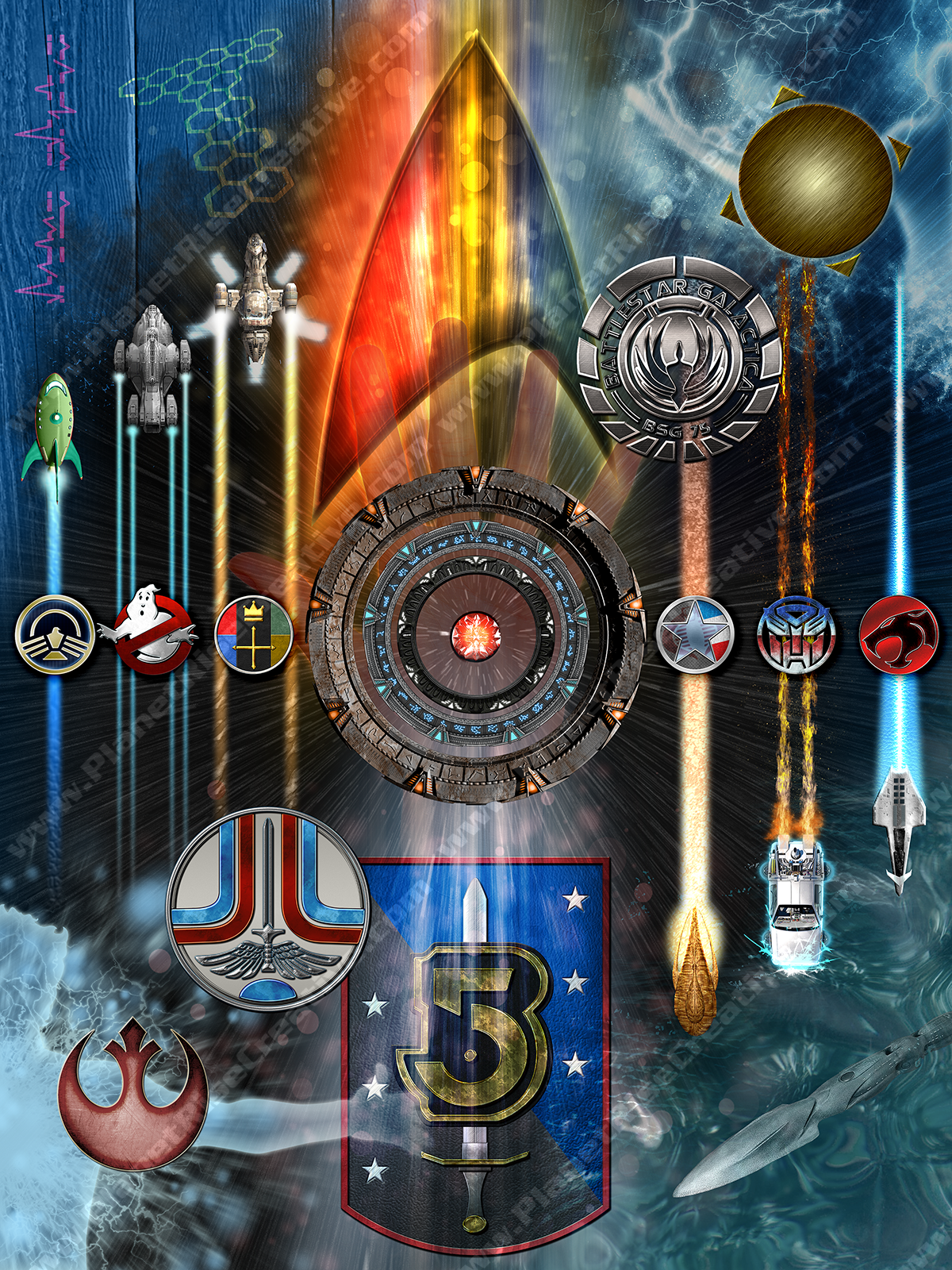
As one can likely tell by looking at this website’s page menu, Star Trek stands atop the list as my favorite science fiction franchise. Accordingly, I knew that would be given a priority placement; larger than most of the other depictions and prominently placed. The simple Starfleet delta would send the message, which in turn made me look at the rest of the list with simple logos or symbols in mind. For many that would work out fine, but a decent number of the properties I had selected never had strongly representative logos like we see in Star Trek, Ghostbusters, Thundercats, etc. so I separated the list into “logos” and “recognizable elements”. When I thought of Futurama, Back to the Future and Firefly the first thing I pictured was the vehicles those series focused on, and pictured them streaking across the poster in some fashion. So I selected six properties to be depicted by ships (or a car) and began collecting images of them to work into the design. In the end I needed to recreate Futurama’s Planet Express ship and the virtually forgotten Earth*Star Voyager in photoshop using reference images as the Planet Express ship had few top-down images available, and the only image of Earth*Star Voyager I could find was a low resolution behind-the-scenes- shot of the filming model. (Stay tuned for a future post about why the Earth*Star Voyager TV movie is awesome and how no one will convince me otherwise.)
Next I moved on to franchises with no logos and no ships. First among them was Quantum Leap, which immediately conjures the image from the opening credits with Sam Beckett standing in the Quantum Leap Accelerator, nearly silhouetted amid blue lights and smoke jets. I knew that pose would be the image and began placing the silhouette in various places on the poster. Yes….I already had the silhouette in my image files. Don’t ask questions. I decided that QLeap wasn’t quite high enough on my priority list to take a central placement so I toyed with showing half of the pose coming in from the side, which opened the door to allow Highlander to be referenced not by MacLeod’s katana, but rather MacLeod himself experiencing a Quickening in the opposite corner from Beckett. That left two corners still up for grabs, and since I was still playing with the idea of using the exterior of the TARDIS from Doctor Who as all or part of the poster’s background I gave it the top left corner. That’s three corners predominantly blue, so it was a cinch to place SeaQuest in the remaining corner.
By now I had selected Star Trek, Babylon 5 and Stargate as the three central franchises to occupy the poster’s middle. Creating screen-accurate replicas of the three different Stargates in Photoshop was not a task I was prepared to undertake, so I lifted those from online and positioned them concentrically in the middle, with a ghostly image of a Logan’s Run Lifeclock in someone’s hand showing through behind it. The two logos above and below, the three to either side and the four on the diagonal were all created in photoshop from the ground up using reference images, some specifically for this poster, others already in my files. From here it was just a matter of deciding what goes where, and what direction to have the array of vehicles traveling. During that process I remembered a few additional properties like Torchwood and Alien Nation which became “graffiti” on the TARDIS, and while it maybe wasn’t anyone’s favorite show, I realized Dollhouse could get some representation literally riding on the back of Firefly.
Some trial and error, a little reorganizing of Photoshop layers, adding in some background effects and I finally arrived at what you see here. The full size image measures 18″x24″, and down the road I am planning to either print and frame the poster, or have it printed on canvas, mounted and shipped through a website I have used before. There is already wall space waiting for it. But I would like to know what you think of this piece? Does it show off the various franchises clearly? Can you identify the 26 properties? (It’s 29 if you count spin-offs individually. Bonus points for naming everything.) Which is your favorite, and do you think any of these are under appreciated nowadays? Any and all feedback is welcome in the comments. Unless you’re mean. We’re not keen on mean here.
